The English Court
Home & DecorationSales Catalog
DESIGN AND LAYOUT OF SALES CATALOG FOR REAL ESTATE PROMOTER
Sober, elegant and clean image.
The design of a catalog for a brand as well known as El Corte Inglés had to measure up.


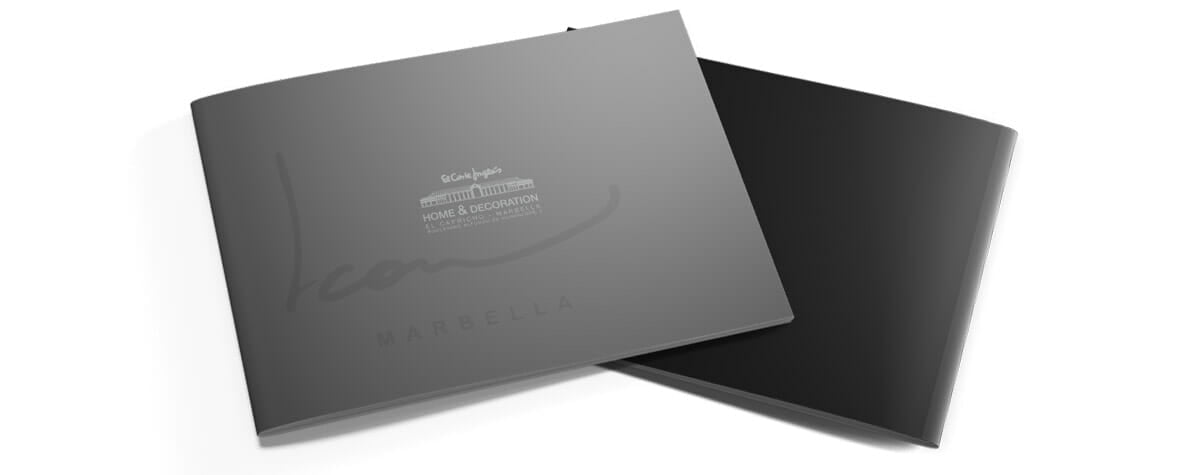
From the first moment we wanted to communicate elegance. That is why on its cover we made it very clear what the line was and we opted for a design with neutral colors, using gray ranges, which would allow us to convey the correct sensations.
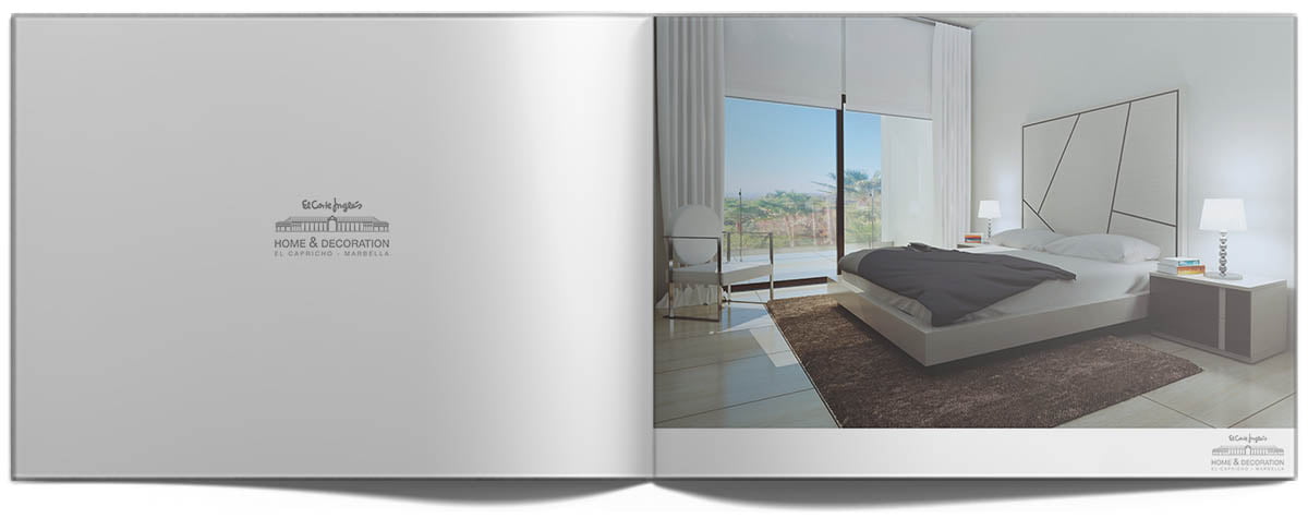
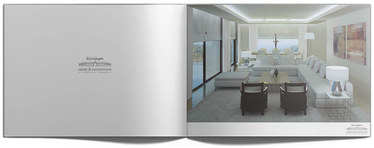
In most of its sections it was decided to leave the even pages with only the small and centered corporate image. This provided a feeling of cleanliness and spaciousness in each section, highlighting the work done in each infographic.
The work done on the infographics was amazing, choosing the exact pieces and their location is an art. Added to this is the technical part, where perspective and lighting are key to making the difference between a realistic render or photo that makes even the most detailed questioners doubt.
Assessment of the project
Ideas are easy, implementing them is difficult, our focus is on make them come true. That is why we observe and analyze the execution in the different areas of the project.
At SEB Creativos from the first moment we set graphic communication as a primary objective in the design and development of the corporate line. We assume the quality standards that our client demands and we respect them to the end, both in design and in the quality of the material and the printing of the chosen medium.
The presentation for this real estate promotion was a complete success, obtaining a very good response and an excellent customer reaction to it.
Impact
We measure what we have done to control, we control to direct and we direct to to get better.
WE SPEAK?
TELL US ABOUT YOUR PROJECT
Your business in the hands of professionals