Geppetto
staging ofBrand| and online channels
CREATION OF BRANDING AND CORPORATE IMAGE WITH LAUNCH ON AND OFFLINE
The moment when the flavor connects with customers.
When the quality and flavor of a product is taken for granted, the objective is to work on the connection that the brand may have with its audience.


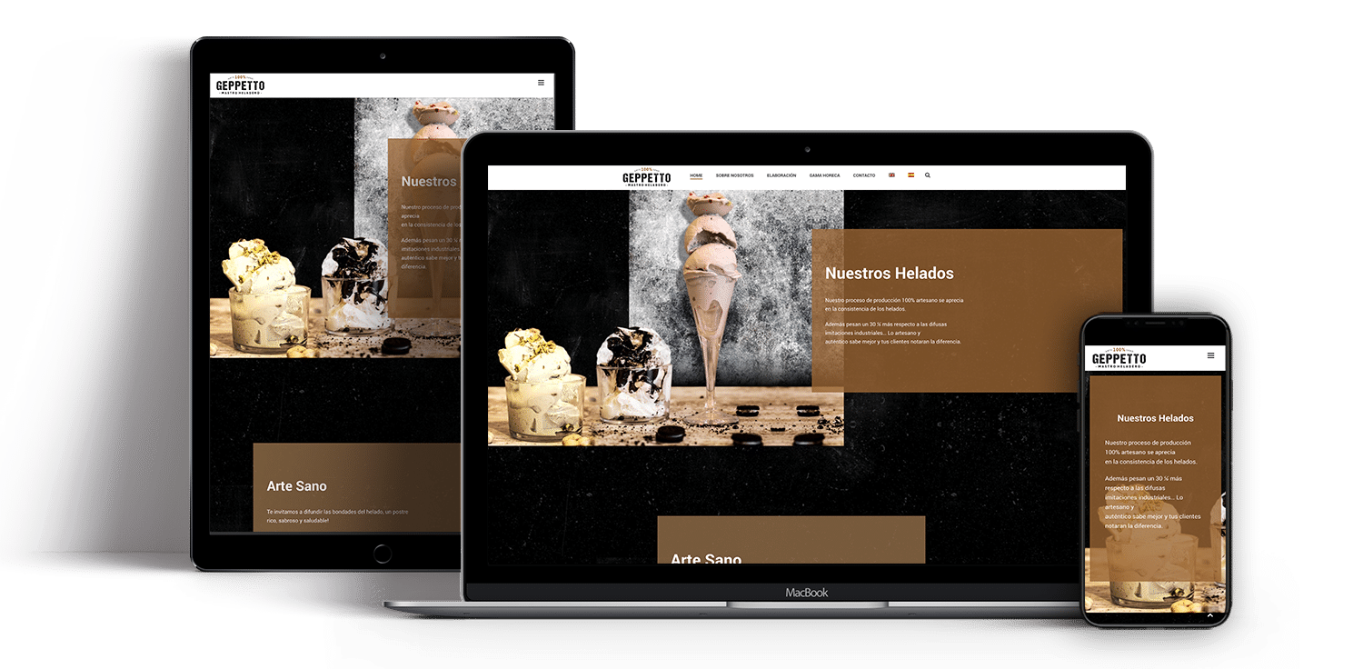
The purpose of this section was to quickly and easily transmit the brand values and the value proposition that differentiates them from their competitors. Direct communication accompanied by irresistibly delicious images is the formula to have a very good reason to stay browsing on this website
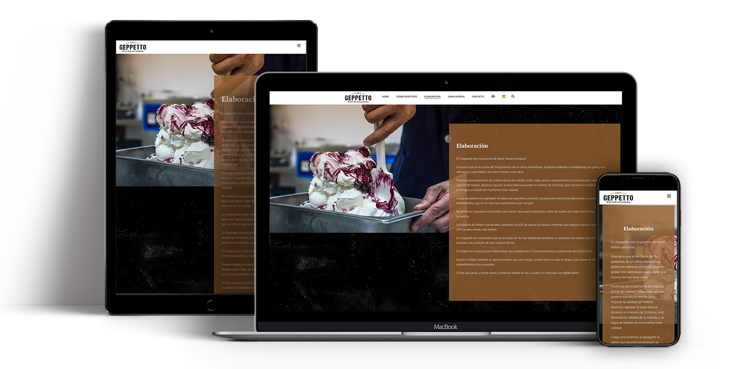
When you need to express that a brand is truly artisan, you should not go very far to understand that the main objective is to show the human part of the brand.A section where the leading role is divided between the product and the producer, showing the latter's point of view is key. Very attractive section thanks to having appetizing product images, its process and gourmet decorations as the final product.
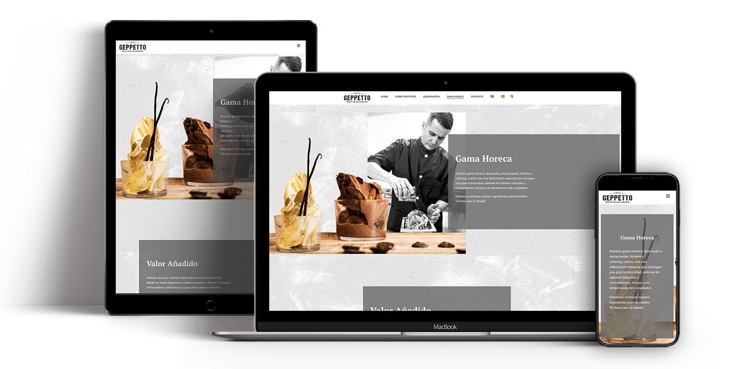
Gama Horeca is a section designed for communication with your wholesale client. A B2B space where the challenge is to convey to a somewhat more demanding customer the advantages of their product.Communication in this section is crucial to differentiate yourself from your competitors from a more industrial model.
Communicating your spirit
Quality, craftsmanship and commitment; three values that we had to communicate as our main challenge. Our client, Helados Gepetto, a craftsman ice cream maker in the province of Malaga, needed to present his product; He needed to define his brand in the market.
To do this, we opted for the creation of a strategy that would position Gepetto as a benchmark of quality in the face of its competition through artisan elaboration with a strong Italian personality. This included the creation of a visual that related the brand with the concepts of "made by hands", "quality and" unsurpassed flavor ", introducing them through rhetoric supported by the relationship between the brand name and culture popular around him.
Assessment of the project
Ideas are easy, implementing them is difficult, our focus is on make them come true. That is why we observe and analyze the execution in the different areas of the project.
In this project we opted to follow a line of natural colors, reminiscent of wood and with the inclusion of strong dark tints; thus combining the natural with the professional, art with character.
Within this line of vision, three fundamental products were created to define the brand; logo, introductory video and website; These, supported by a solid creative strategy, managed to show a style line that gives the brand today a homogeneous and elegant personality.
Impact
We measure what we have done to control, we control to direct and we direct to to get better.
Sources used for the interpretation of the results; Offline survey and Google Analytics
WE SPEAK?
TELL US ABOUT YOUR PROJECT
Your business in the hands of professionals
