Logo Abogados – What to consider before creating it
When thinking about a lawyer’s logo, there are several aspects to consider before starting with the design.
First of all, we have to think not only in designing a logo, but in creating a brand for this project, this does not mean that the logo is not so important, which it is, but it is an important part of the brand and must be accompanied by other elements that make up the brand, such as a good naming, a slogan, the corporate typography, the colors, the target public, the values we want to communicate, the presence in the media, etc.
In this article we are going to focus on the creation of the logo, but it is very important to consider the branding aspects we have mentioned.
Assessment prior to the creation of a Logo for lawyers
To begin with, considering that we have a naming (brand name), we must think about what we want to communicate or transmit with our logo, what is our target audience, what kind of language will we use to reach them?
These three questions are the basis, let’s give an example of what we want to transmit or communicate, in the case of a logo for lawyers, it is important to transmit confidence, experience, knowledge, tranquility, leadership, since this is what clients need when hiring this kind of services.
What is our target audience, generally legal services are hired by people between 30 and 60 years old, this may vary, but we must establish a segment to target, it is generally people with job stability and certain maturity.
The type of language we use to address our audience should be serious and polite, not too technical, but at the same time transmitting confidence and knowledge.
Once we have all this clear, it is time to design the elements that allow us to transmit what we want, using appropriate shapes, colors and typographies.
Symbol or Anagram of a logo for lawyers
When we think of the shapes, called symbols or anagrams that can accompany our logo, the typical scales or sword of justice or the wooden gavel of the judges surely come to mind.
The mallet or mallete has become today, along with the scales and the sword, the most identifiable symbol of justice around the world, which is why it is very present in the personal brands of lawyers or law firms.
Another option that is also commonly used in logo designs for lawyers is the creation of a symbol or shield with the initials of the name in an elegant way or simply the text with some alterations to give it more personality.
Or a union of both styles, the key is to focus these symbols or typographies in a different way, since the most creative logos are generally the ones with the most personality and therefore the ones that last longer and are identified by their potential clients.
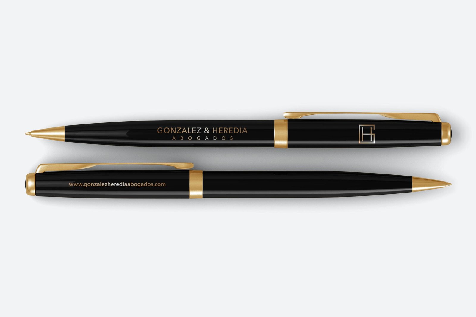
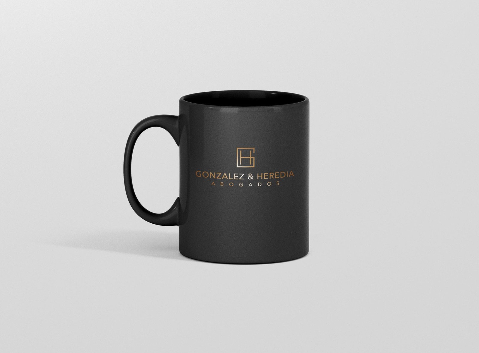
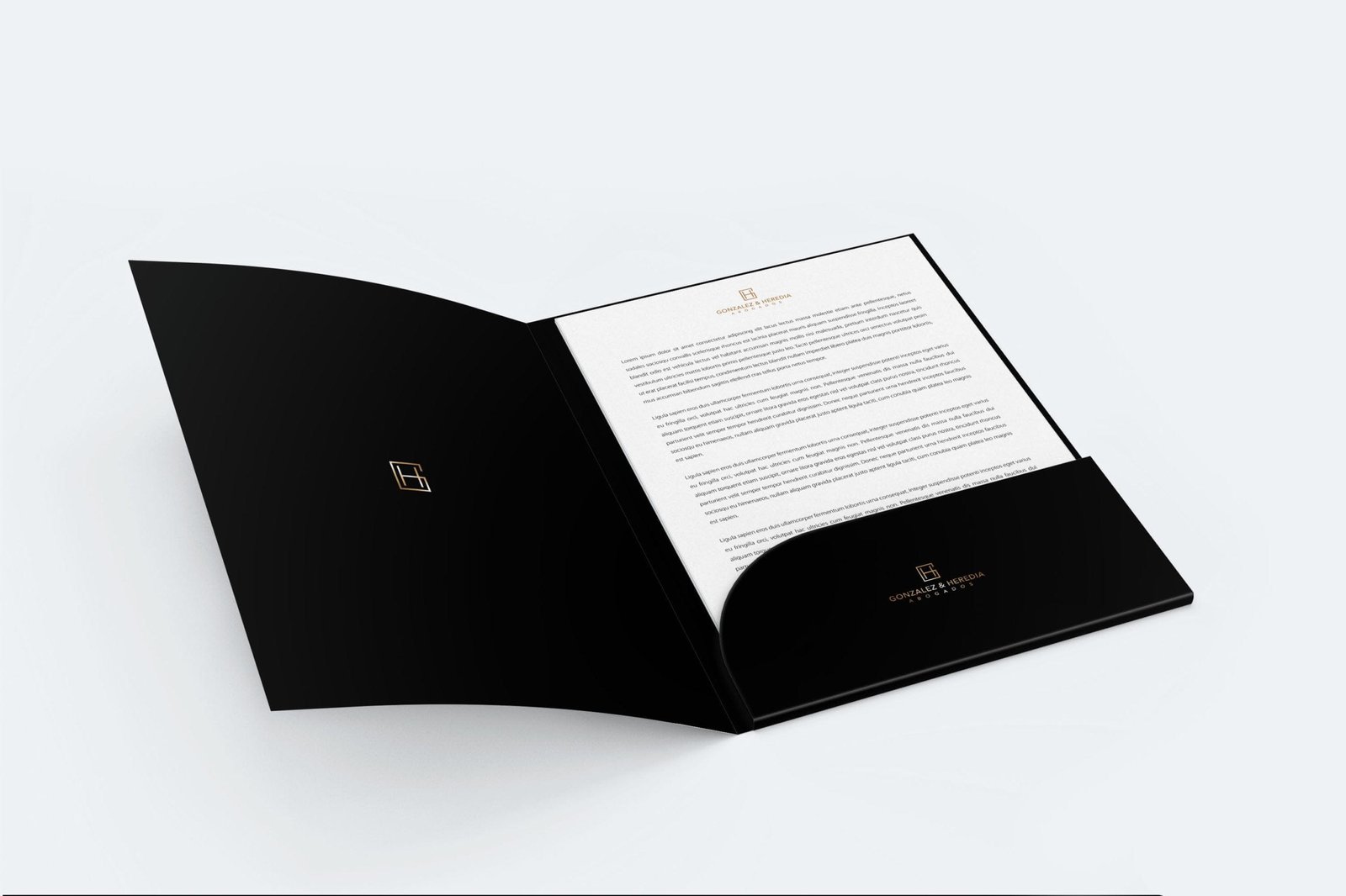
In this article we will be based on the example of a symbol created with the initials of the name and a modern and minimalist logo style, for a current brand.
A good way to start with the design of the symbol is to make the first sketches with paper and pencil, where we will have more freedom of movement and we can arrive more quickly and easily to a form that is close to the idea we have in our head, and then to take it to the design on the computer following those guidelines.
As we have already explained in other articles, the programs we use for logo design must work with vectors, that is to say, with lines or strokes and not with pixels, since when working with vectors the logo can be scaled to any size without losing quality.
For those who are thinking about which program to choose, one of the most used is Adobe Illustrator, Corel Draw, In Design, Affinity Designer, all of them are under license, but we also have free variants such as Inkscape, Karbon 14, Sk1 Project or Scribus.
We recommend to make all our designs in black and white at first, so as not to be conditioned by the colors, which we will choose later on.
In our agency we use the entire Adobe line, which in this case would be Illustrator, we consider it to be the best tool for handling vectors.
When we have defined the symbol or anagram, our recommendation is that you make it in strokes, that is to say, in lines that we can fatten or refine, so that at the moment of choosing the typography that will accompany our logotype we can unify the thicknesses, thus maintaining a uniformity and corporate line.
Creation of the logo
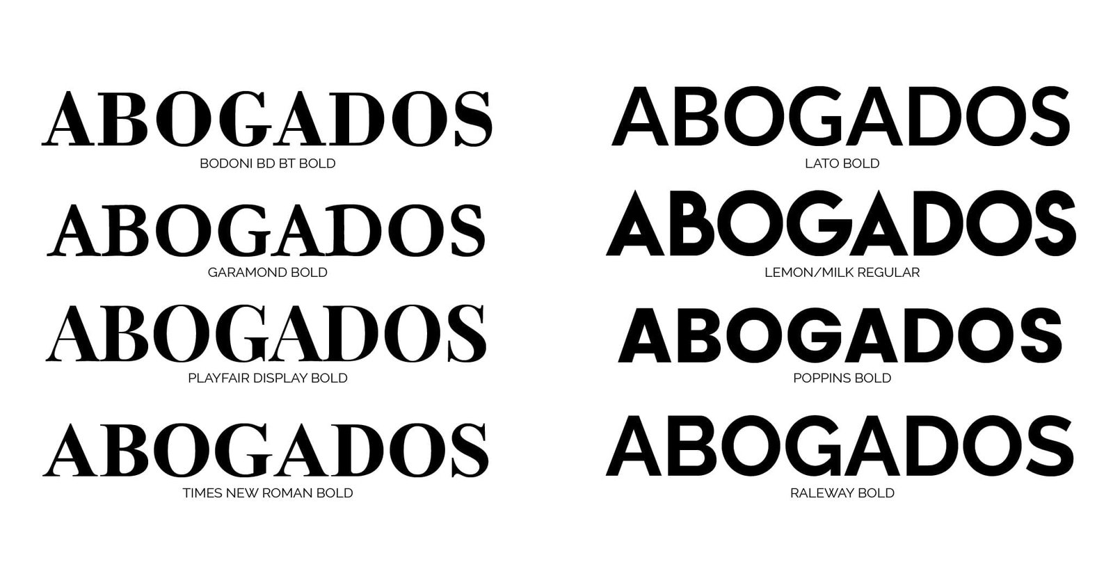
Well, it is time to choose the typeface for our logo, for this stage, the ideal is to go to a typography website where you can filter by style, serif, sans serif, calligraphic, modern, etc. and you will have plenty of options to choose from, because if we only rely on the fonts we have installed on our computer, we reduce the possibilities too much.
If we have already chosen the typography, we always recommend that you make some kind of variation or change, to give the logo a greater personality, that is to say, if someone writes our name with this typography, they will not get our logo just like that, for this reason, it is always advisable to make certain changes to the typography, such as removing a cane, modifying the serif, varying some of its letters, etc.
Choice of colors for the logo
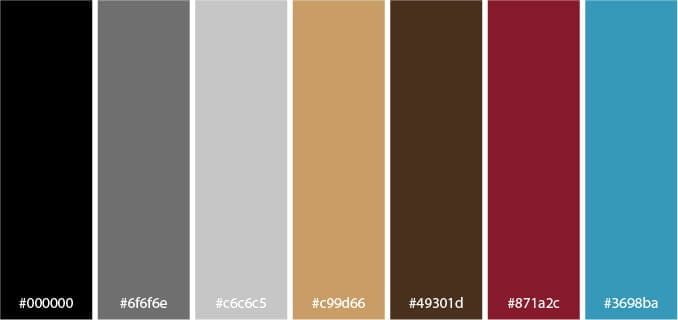
We have our symbol ready, the typography of the logo with its modifications, it is time to choose the color we want for our brand, it is important that we take into account the psychology of colors, as unconsciously each color transmits different sensations, we return to leave the table of colors and what each one transmits, anyway, so that you have it easier, we have designed a color palette that fits very well for brands of legal sectors.
Corporate identity manual
Once we have all the elements that make up our logo for lawyers, it is essential that we make a corporate identity manual, for those who still do not know what this manual is, it is a kind of dossier in which we will detail all the elements of the logo, symbol, typographies, colors, variations, correct and incorrect uses, etc.
This manual is very important to have, so that every time the logo has to be used in our corporate image, it is used correctly and always following the guidelines detailed in the manual.
[kkstarratings force]
