In this article we want to show you how to create a logo for your pharmacy from scratch, but first of all let’s go into the history of this type of logo.
History of the Pharmaceutical Logo
The logo of your pharmacy is very important, since it will be present in all the branding of your business, branding, for those who are not yet familiar with this word, is the management of a brand with the aim of making it known, although pharmacies are a commercial sector of primary need and customers come to them regularly when they need medicines, increasingly we can see modern premises with a careful design and a well applied brand throughout its corporate identity.
When thinking about a logo for your pharmacy, either to design it for the first time or to restyle (update) an existing logo, it is important to think before, what we want to communicate with our brand, for example, modernity, elegance, seriousness, commitment, which style we feel more identified with, classic, vintage, minimalist, modern, futuristic, etc.
Cup symbols with snakes in a Pharmacy logo
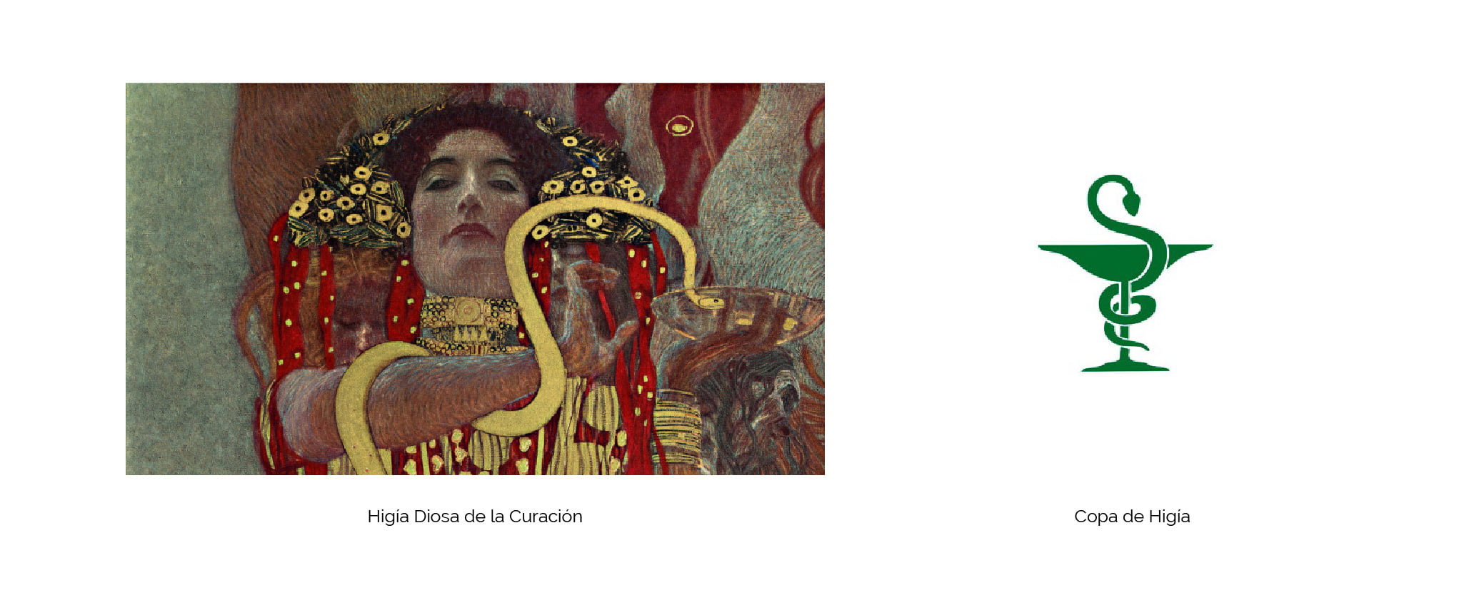
We have all seen some old or classic logos of pharmacies, where we can see a cup with a snake coiled in it, known as Hygeia cup, this symbol comes from ancient Greek mythology, Hygeia the Goddess of healing, a few years ago this was the most used symbol in these premises, over the years, it has been modernized and today the anagrams that represent this sector vary quite a lot, although being a type of business that must be easily recognized by all its customers, as it is of primary need, we can not move away from symbols that we already recognize as representative of this sector.

Cross symbol in a pharmacy logo
The second and more international symbol is the green cross, which is still used despite the passage of time, and has become an essential signage that all pharmacies must use to be easily recognized, although in some cases it is not part of their original logo.
This symbol was born from the emblem of the red cross, which is used in health centers, hospitals, etc., and the pharmacy decided to adopt it and to differentiate itself, changed the color to green, which means hope, nature, or the plants with which they elaborate their formulas.


Traditional pharmacy logo ideas
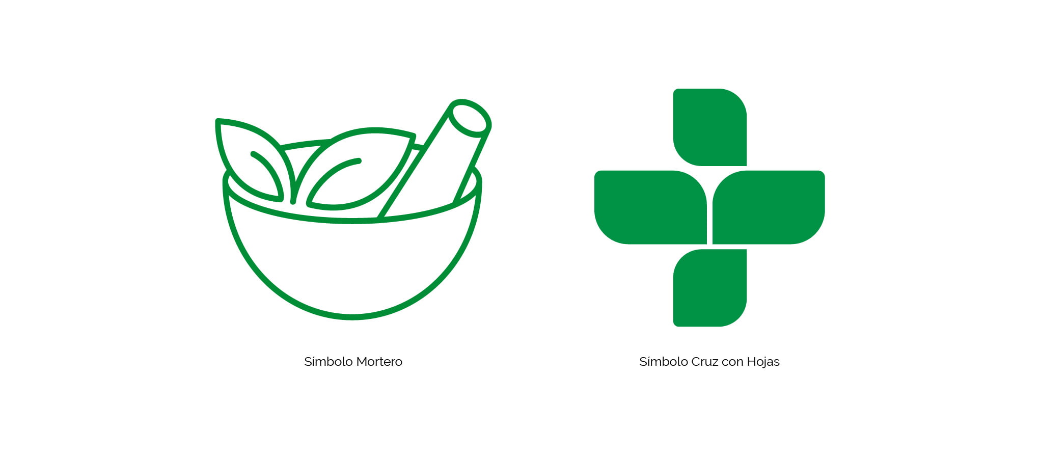
In addition to these two internationally recognized symbols, we can let our imagination fly a little and design a symbol that escapes a little from these two commonly used clichés, fresh ideas are always welcome in the world of design, but we must never forget the main thing, we want to communicate with this symbol or anagram, in the home of a logo of a pharmacy, must be elements that convey health, healing, medicine, etc..
Some designers opt for the particular mortar with which the medicinal mixtures were prepared, if we want to give a more natural image some opt for the ecological style using recycled or kraft type sheets and supports.

How to create a logo for your pharmacy
Once we have been put in situation about this symbology, it is easier to understand certain points that we must take into account at the moment of starting with the design of a pharmacy logo.
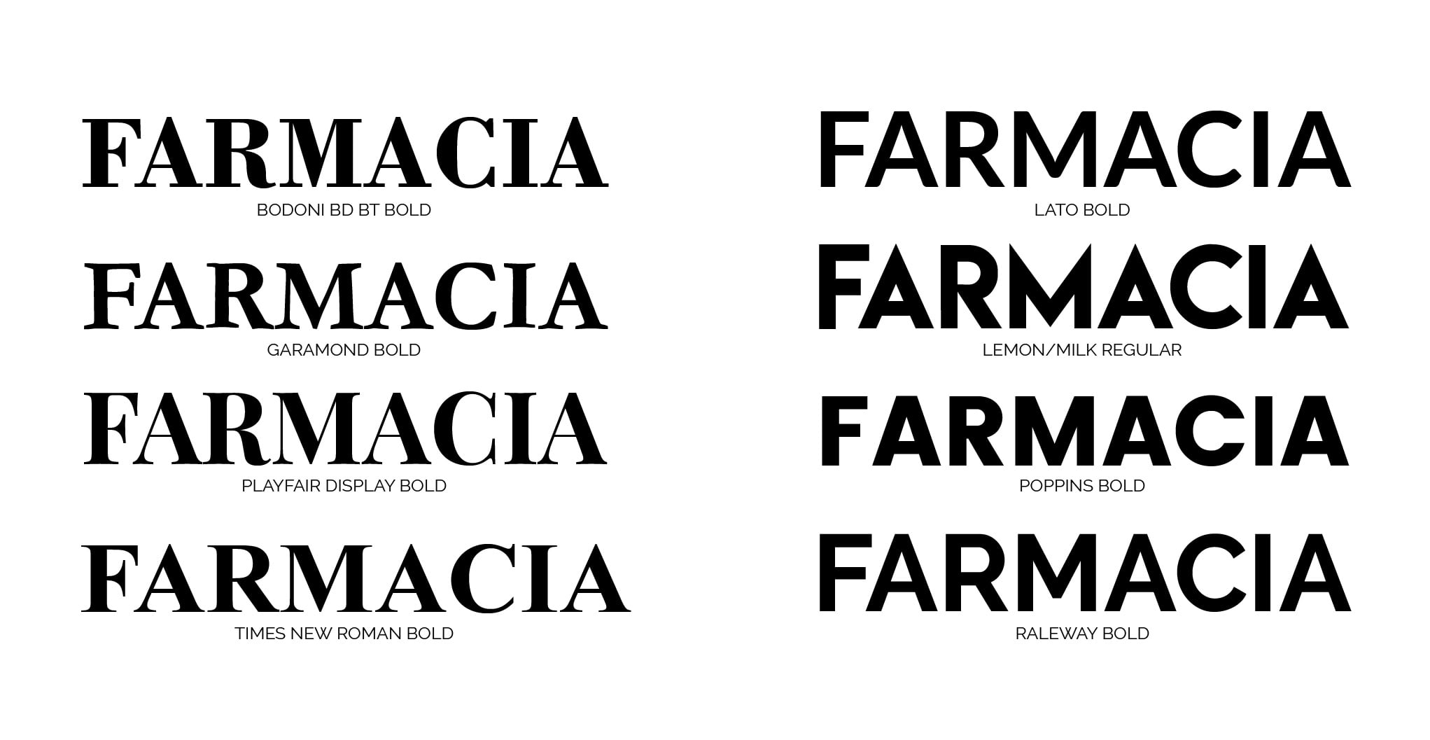
It is important that the typography (typeface) is very legible, we can choose fonts with serif (cane), these provide a more classic style, come very for pharmacies with many years of antiquity, as many pass from generation to generation and want this message present in your brand.
Sans serif typefaces are also a very good option for this sector, we have an infinite number of typeface families with this style and with them we can bring more modernity and a more modern look to the brand.

Handwritten or calligraphic styles are not the most recommended for this sector, since pharmacies should be easily recognized, unless the chosen typography has very good legibility, but we do not really recommend its use, at least in the word “Pharmacy”, which could be used in the name, which is less relevant.
Having clarified the most commonly used symbols and recommended typographies, we move on to color. We have previously mentioned that when the red cross symbol was adopted, the pharmacy chose green as its distinctive color to differentiate itself.
That said, the international corporate color for this sector is green, or at least the cross should be in that color and the corporate image with a color palette according to the green color of its international symbol.
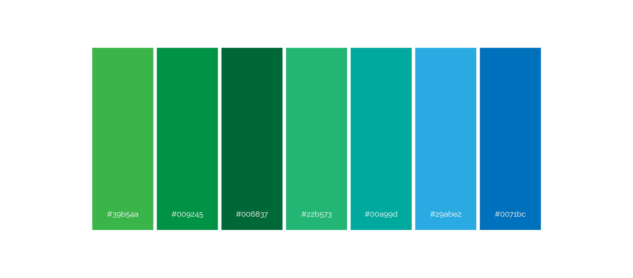
Here are some color palettes that we recommend to use as corporate colors in addition to the internationally recognized green color to distinguish this sector.

Adaptation of formats of a Pharmacy logo
We must know that a logo must have the possibility of adapting to different variants, without losing its corporate line and maintaining the parameters stipulated by its designer in the corporate identity manual. In the case of pharmacies, we must have a version that is easy to recognize and that adapts to the sign of the store’s façade, leaving the word pharmacy as the most relevant text of the logo, since the rest of the name is important but not as relevant as the symbol of the green cross or the word “Pharmacy”.
We should also have a variant of the logo in square format for social networks and that all these elements that we have discussed in this article, such as its symbol, typography, colors and variants of the logo to adapt to different applications, should be part of the brand’s corporate identity manual, so that its use always follows the same corporate line and does not vary by not having all these elements stipulated in a single dossier to be used every time the brand is applied.
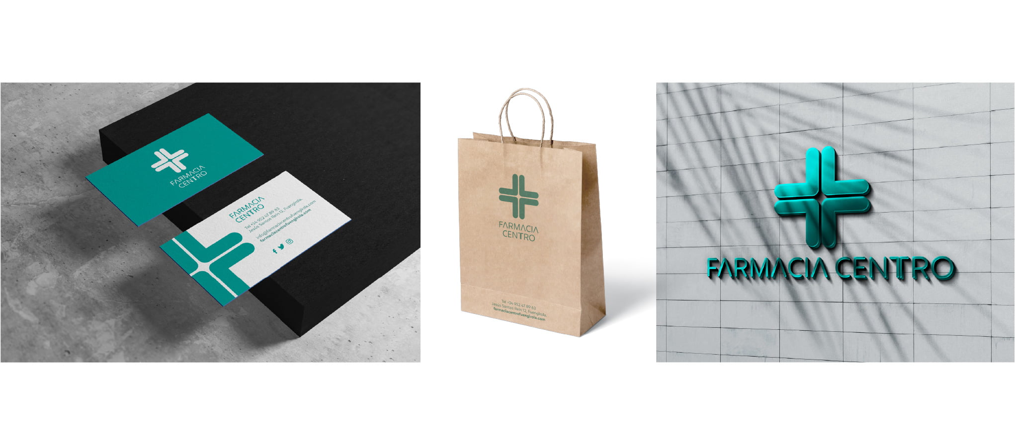
Knowing these concepts explained in this article, we can see that the creation of a brand is not only the design of its logo, it has many more concepts and elements that are thought before getting down to work with its design, for this reason it is very important that this work falls into the hands of professionals, since each brand and even each business sector must be represented correctly to be recognized as such.
If you are a designer and you are starting or you have experience and you are looking for a job as a designer, nowadays there are platforms where you can apply for different jobs in the design world, we recommend jooble where many companies publish their job offers to find personnel.
[kkstarratings force]
