At a very basic level, logos are symbols composed of text and images that help us identify the brands we like. But they can be so much more! A good logo is the cornerstone of your brand. It helps customers understand what you do, who you are and what your values are. That’s a lot of responsibility in a small image! So let’s get to the definition of what a logo is and how to make the most of it.
What is a logo?
A logo is a symbol composed of text and images that identifies a company. A good logo shows what a company does and what the brand values.
Logo design is about creating the perfect visual brand for a company. Depending on the type, a logo usually consists of a symbol or trademark and a logotype, along with a slogan.
What is the function of a logo?
Logos do something besides looking pretty, right? Yes! Logos serve many functions.
A logo makes you stand out from the competition.
Perhaps the most important function of a logo is to give your company a unique brand that differentiates it from other companies.
This is especially important if your business has competition (which 99.9% of them do). Before you get a logo for your business, you’ll want to research what your competitors look like so you can position yourself.
To give you a practical example, look at how the Cactus Dental logo separates itself from the sea of cliché tooth logos in the dental industry by taking a unique feature of its geography and turning it into a toothbrush.

With this example we don’t want you to go to the extreme and design a logo so complicated that even your own potential customers won’t understand it.
How to make a logo?
At the time of creating your company or business, this is one of the questions that many of you ask yourselves: How to make a logo? Our opinion is, whenever possible, to let a professional take care of this task, because the logotype is your letter of introduction and should communicate the values and personality of the business.
How to make a logo in 8 steps?
1.- Previous investigation
The first thing we have to think about when creating a logo is what we want to communicate with it, that is why it is important to investigate the competition, paying more attention to the strongest brands in the market, they have surely already carried out this process with the help of professionals, see how they use colors, symbols, what their logo transmits, etc.
2.- Analysis for logo creation
Once this research is done, we must make an analysis of our brand, making a list of the values we want to communicate, for example, responsibility, integrity, passion, etc. What we want to transmit with it, for example, modernity, class, elegance, etc. All these values will have a great influence on the creation of our logo.
3.- Typography
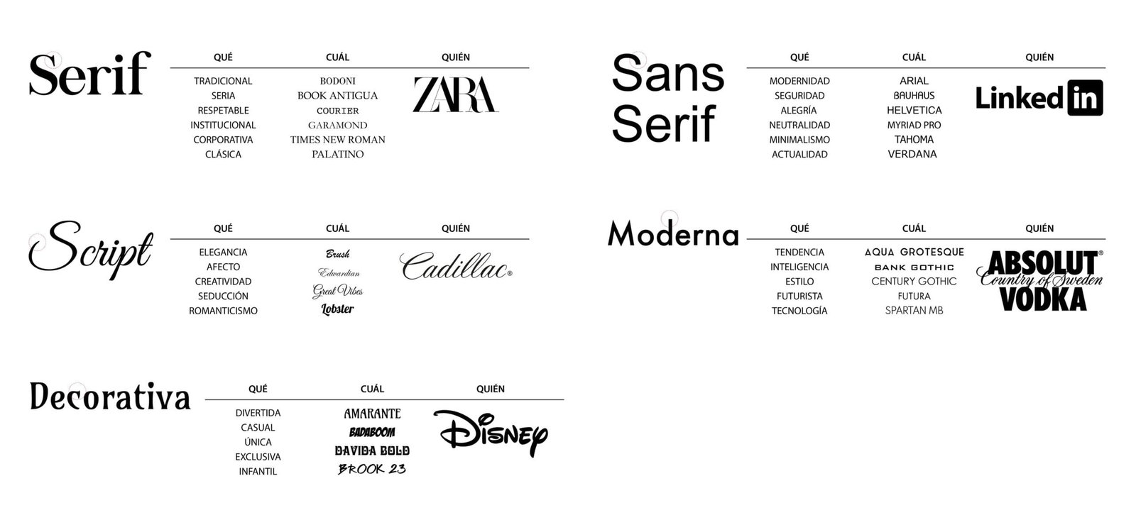
Typography is one of the fundamental points of our brand and of course in the logo, its choice should depend on what we want to communicate with it, we leave you a small table that can help you choose the right font that you can use for the creation of your logo and a link where you can download fonts for free.
Psychology of Typography:

Free Typography Websites:
https://www.dafont.com/es
https://www.dafont.com/es/
https://www.fontspace.com/
https://www.1001freefonts.com/
https://www.urbanfonts.com/
4.- Color in a logo
The choice of your corporate color is important, it will not only be present in your logo, it will be present in all of the branding of your company, business cards, brochures, folders, invoices, premises, website, etc.
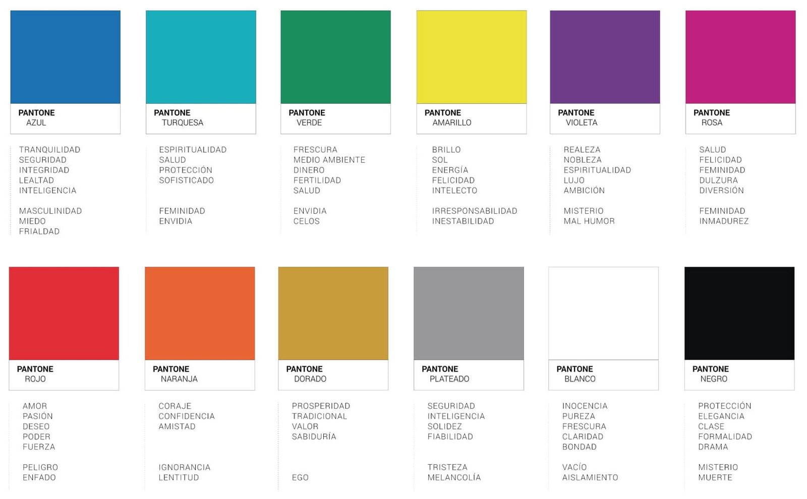
To know if we are choosing the right color with what we want to transmit, you can observe this color palette with the sensations that each one of them transmits, they will help you to know how to make a logo with the right colors.
Color Psychology:

5.- Shapes that a logo can take on
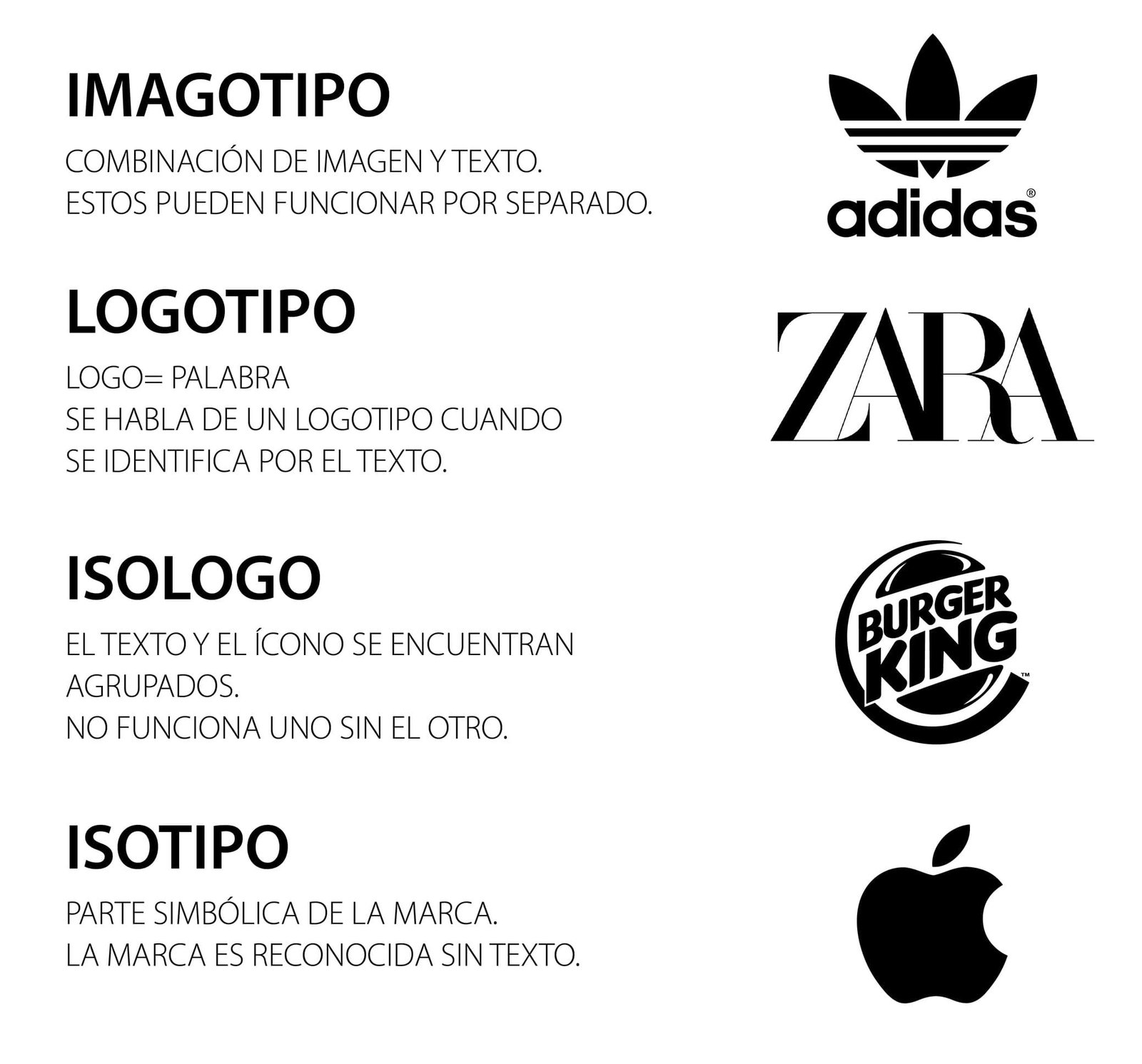
In most cases, brands have a shape or symbol that identifies them and separates them from their competitors, it can be a symbol that accompanies the logotype (imagotype), or simply that the text of the brand (logotype) has changes or deformations to make it more personal and unique, that it is not just the written name without more, another option is that the logo and symbol are grouped in a single design (isologotype) that do not work one without the other, and finally, but which is recommended only for established brands is simply a symbol that represents your company (isotype), here are some examples to give you a better idea of each of them.

6.- Brainstorming to create a logotype
Bearing in mind all the above, we will start brainstorming about the corporate typeface, the colors we are going to use in our brand, in case of using a symbol or anagram, think about which would be the one that best identifies us, it is always advisable to be clear about all this before starting to design the logo, since we will have a solid base and we will know what to do or what we will need when we start designing the logo itself.
7.- Vector logo or logo in vectors
What is a vector logo?
A vector logo is one that is designed in a program that works with vector-, that is to say, lines and not pixels as for example, Illustrator. Why do I have to make a vector logo? Take into account that the vectorized logo must be able to be applied in different supports, let’s give an example, imagine that you design your logo in an image editing program like Adobe Photoshop, this type of program works with pixels and not with vectors, what difference is there, that the pixels when they are enlarged lose resolution and the vectors being lines you can enlarge them as much as you want and they will always look perfect.
That is why you vector logo must be designed in a program that works with lines, such as Adobe Illustrator, Corel Draw, Affinity Designer or vectors, so that its final result is in a vectorized format and can be scaled without problems.
In short, a vector logo is much more efficient and professional, but what to do if my logo is designed in pixels? Do not worry because there are many programs that will help you to vectorize your logo, that is to say that you will not have to design your logo again but you can simply use tools such as www.autotracer.org to transform your logo from pixels to vectorized logo.
8.- Corporate Identity Manual
It is always recommended to create a corporate identity manual (summarized), which means this, it is a small dossier where we will find the logotype in all its variants, for example if it is a logotype with symbol (Imagotipo), that is the logotype with its symbol, only the symbol and only the logotype (text), in addition to its chromatic variants, that is to say, the logotype in its corporate color, in negative (corporate color background and white logotype) in black and in negative (black background and white logotype), especially if you need it for the design of a web page.
Typefaces used for the logo with its name and an alphabet in uppercase, lowercase and numbers.
Corporate colors and other secondary colors recommended for your corporate image with their color codes, Pantone, Hex, RGB and CMYK are recommended.
Remember to align well all the components of your logo, take into account the sizes of the typographies, make sure they are all legible, combine the colors well so that it is easy to distinguish.
Recommendations on how to make a logo:
Beyond all these steps that we provide to know how to make a logo or the creation of your brand, it is always advisable to entrust this task to a professional, they will know how to guide and advise you during this process, they will design different proposals that communicate and transmit what your brand needs.
Keep in mind that they will have gone through all this thousands of times and have a great experience so that your logo is very special, personal and easy to recognize, that communicates to your potential clients the values of your brand and transmits the sensations that your company wants to communicate.
Rules to take into account if you want to design a logo:
Anyway, in case you design the logo yourself, in addition to the steps we have proposed, there are certain rules you should take into account to create them:
- Your logo must be recognizable, if you put together too many elements and too many colors, it will be more difficult for people to remember it, in this case we always recommend the minimalist, less is more if it is well applied.
- It must be legible, do not go overboard with artist or modern, using difficult to read typographies, it must be very clear and legible to the naked eye.
- It must work in black, in addition to the corporate colors you use, it must work in black in the same way as in color, imagine you have to be able to use it on a stamp or invoices in black and white.
- Typefaces, we do not recommend using more than 3 typefaces in your design, if you abuse the mix of typefaces, you will confuse people more.
- Colors, we do not recommend using more than 3 corporate colors either, first of all because with too many colors you take away the elegance of your design and remember that the simpler your logo is, even if it communicates the brand well, the better.
In SEB Creativos we have a team of professionals who can create your project from the corporate image to its launch and its subsequent online marketing to take over the market.
Do not hesitate to contact us, we will be happy to advise you in everything you need.[kkstarratings force]


